-
Architects: Christ & Gantenbein
- Year: 2011
-
Photographs:Roman Keller
-
Manufacturers: Sulser AG
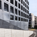
Text description provided by the architects. The striking six-storey retail and office building building occupies the triangular site between the station and the head office of Basellandschaftliche Kantonalbank (BLKB). The constrictions of the site meant that the building’s footprint had to be smaller than its upper storeys, resulting in a downward tapering shape, and the dark anthracite-coloured concrete conveys a sense of robustness and stability at this dynamic location.

The main entrance into the central hall and to the shopping area features an imposing shop window front facing the station square. The entrance leads to the shops on the ground floor and to the upper storeys. The receding façade at ground floor level creates a generous protected area in front of the shop windows for passers-by as well as for those waiting for buses, thus achieving a marked improvement in the quality of this public space.

The access for deliveries and to the storage facilities and technical services area has been separated and approaches from the lower Soodweg on the eastern side of the building. The two car parking floors underground are accessed via the BLKB’s car park building.

The basic motif of the façade design results from the 2.65 m wide grid used for the office design. The building façade is evenly divided into façade elements in dark fair-faced concrete, with the width of each element being that of the office grid. The grid pattern was chosen to allow the floor space to be used for different sized units, i.e. for individual, combined and open plan offices. The floor spaces are arranged around a central services core and, with a depth of 7 to 10 m, provide the flexibility to accommodate a range of functions.

The building is the first important component of the development plan for the new station quarter in Liestal.


